Multimedia Art Journal 1 – Layout 3 – Part 5 – Lilac Acrylic Paint Splatters

Multimedia-Art-Journal-Acrylic-Paint-Purple-Lilac-Splatter-Stencil-Tim-Holtz-Idea

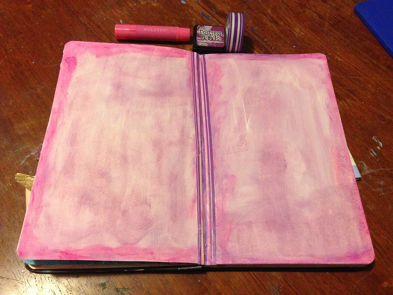
It has been soooooo long since I did anything on my multimedia art journal and I left my third layout incomplete as I ran into a creative block of sorts. I purchased some new Tim Holtz stencils and so I wanted to give them I shot but I quickly found my gesso with stencils skills inadequate still. As I glared at my craft supplies in frustration, suddenly, a spark ignited and I grabbed the tiny lilac tub of acrylic paint. The tub was leftover from a completed paint-by-number kit. I used the light purple paint and the Tim Holtz Splatter stencil to create lovely paint splatters all over the layout. I absolutely love how this turned out and I feel invigorated again to complete this layout.


Multimedia-Art-Journal-Idea-Tim-Holtz-Paint-Splatter-Stencil-Texture-Purple-Lilac

This is really why I love art. I came home feeling angry and annoyed and simply creating something pretty with a pleasant texture just clears all the stress away. And as this idea sparked more ideas started to flow. Look at that texture!

Multimedia Art Journal 1 – Layout 3 – Part 4 – Faber Castell Gesso with Tim Holtz Dot Fade Stencil

Faber-Castell-Gesso-Multimedia-Art-Journal-Tim-Holtz-Dot-Fade-Stencil

I just felt like the whole layout was a bit too bright and vibrant and I wanted to tone it down a little, especially if I’m going to have another sentiment or a quote on the page – which I’m still trying to brainstorm, but I didn’t know how I was going to desaturate the page. As it turned out when I was trying to add Tim Holtz Dot Fade stencil accents using gesso, I was continually mucking up the gesso, as I always seem to do when applying gesso, and when I mucked up, I just rubbed the gesso in a circle using a baby wipe and that’s what has created that cloudy effect that has really dulled down the colours in exactly the way I wanted. Such a beautiful mistake. I love the effect! As well as the smokey effect, as I had left some gesso dots on the page for a while before attempting to remove them with the baby wipe, I added a dimensional effect quite by accident. Really happy with how this multimedia art journal session turned out. But now I’m outta ideas!

Multimedia Art Journal 1 – Layout 3 – Part 3 – Simon Says Stamp Love Heart Border Clear Stamp

Simon-Says-Stamp-Love-Heart-Acrylic-Clear-Multimedia-Art-Journal-Layout

For some reason I felt the need to put lines of love hearts all over the page using Memento Dew Drop Ink pads in hues Teal Zeal, Rose Bud and Lilac Posies, alternating between the three colours. It was kind of a cool idea I suppose, but it is a very vibrant and bright result. And still at this stage I do not have an end result in mind so I have no idea in which direction this decision is going to lead me. I do like the blending of the colours and I think it brings down the pink a little and is starting to lead it more towards the purple I was looking for. I used a love heart border stamp from a Simon Says Stamp exclusive stamp set called Sending and Wishing from the Better Together release.


Multimedia Art Journal 1 – Layout 3 – Part 2 – Blue Gelatos Swirls

Blue-Faber-Castell-Gelatos-Art-Journal-Layout-Seedless-Preserve-Ink

Because I had created a more magenta-pink colour for my background, when I was aiming for a purple, I decided to try adding some blue to try and trick the eyes into automatically mixing the colours together themselves. I didn’t really like the way the blue gelatos blended together with the colours already on the page, as it was quite strong, so I changed my tact once more and decided to do wispy swirls and accents all over the page.

Seriously, if you haven’t tried doing multimedia art journals yet, try it! It’s so relaxing, rewarding and motivating! Even when you make mistakes or things don’t go according to your initial plan, it is still incredibly enjoyable and you can just continuously evolve your vision.

Multimedia Art Journal 1 – Layout 3 – Part 1 – Washi, Gesso, Ink and Gelatos

Pink-Faber-Castell-Gelatos-Art-Journal-Layout-Tim-Holtz-Distress-Ink

I’m sooooo excited to be starting another multimedia art journal layout. I seriously love creating these pages. As I was finishing up my second layout, which you can check out by clicking here, I already felt I needed to make the next page purple. So that’s how I started!

I put a strip of purple and white striped washi tape down the middle of the page along the binding to give it some strength as already with the other two layout pages the remaining pages were starting to stretch away from each other. After that, I did a gesso wash to give the page a nice surface to work on. From there I did a light wash using a baby wipe and the Tim Hotlz purple ink called Seedless Preserve. I then went around the edges with a pink Faber Castell Gelato and rubbed it in with my finger. I don’t own a purple gelato and using the pink brought out the red in the ink more making the whole page look more magenta then purple.

I had to solve this… as I definitely wanted the page to be more purple than pink.