Christmas 2015 – Christmas Card Making – Lawn Fawn & Penny Black

Simon-Says-Stamp-Christmas-Card-Making-Idea-Merry-Snowflake-Warm-Winter-Wishes

This is the last of the set of cards I made with my bestie, Yvette. For this one we used some chipboard letters and we adhered them lightly to the card and then used Tim Holtz Peacock Feathers Distress Ink and we rubbed the ink over the top of the letters and in between the cracks to create the “merry” in white with the light blue around. We used the snowflake stamps from the Lawn Fawn Critters in the Arctic stamp set using the Tim Holtz Peacock Feathers Distress Ink, Memento Teal Zeal Ink and a Memento Northern Pine Ink. The Northern Pine is supposed to be a green, but it is so dark it looks like black. So we stamped once on a scrap piece of paper and then stamped on the card for those ones to create a nice grey.  We finished up with the sentiment “warm winter wishes” from the Penny Black Whoooos Wishing Stamp Set.

Thinking of You – Get Well Soon – From All of Us – Basic Grey Grand Bazaar Card Idea with Lawn Fawn Hedgehugs Hedgehogs


This card is very special and I’m very proud of it. I made this card for a workmate and his son who is very ill and has had the sickness since he was very young. The son is only 13 years old and the dad is very hardworking. I was diagnosed with cancer in 2008 so I know how hard it can be constantly going to the hospital for treatments, the stress it can put on family, and the financial strain.

The dad is the sole earner as the mother is caring for the son. As such, I would expect that they wouldn’t have a lot of spare money to waste on entertainment as a lot of the funds would go to medication and treatment. My idea was to take $1 and $2 donations from the other employees at work (as that’s only like a chocolate bar) and it would all add up and then we could get a gift card so the son could buy a video game.

Everyone’s really jumped on board this idea a lot more than what I originally thought and the bosses have said that whatever the employees raise they’ll match it, which is really incredible!

Basic-Grey-Grand-Bazaar-Thinking-of-You-Card-Idea-Get-Well-Soon-Lawn-Fawn-Sending-Hedgehugs


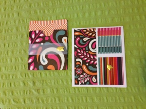
For the design, I started with a base white card, standard size, and I cut a strip and two squares of Basic Grey Grand Bazaar pattern papers from the Grand Bazaar Card Kit. This is inspired by a Becky Williams design which is included in the kit. I did have to alter it to suit quite a bit though. In the card kit supplies are envelope pockets and there were only 2 spares after taking into account all the designs, which I really want to try them all so didn’t want to use up. The 2 spare pockets weren’t in a pattern that I wanted or looked good with the front design of the card.

So I took a 12 x 12″ sheet from the papers I have stored and I unstuck the glue of the pocket size I wanted and laid it flat on top of the 12 x 12 inch sheet and I cut around the edges. After cutting it out, I used the Chomp-a-Dile Corner Cutter to make the corners rounded and then I used the Martha Stewart Score Board and the bone scorer to score lines to fold the sheet into the pocket. I adhered the pocket together and voila!

I decided I wanted to use the two foil arrows spare from the card kit and I had the idea of embossing ‘from all of us’ onto the pocket. As the pattern paper was dark, I decided to use a strip of vellum which I wrapped around it and adhered at the back.

Basic-Grey-Grand-Bazaar-Thinking-of-You-Card-Idea-Get-Well-Soon-Lawn-Fawn-Sending-Hedgehugs

Next I stamped the two adorable little hedgehogs from the Lawn Fawn Hedgehugs Stamp Set using Memento Tuxedo Black Ink. I stamped the ‘thinking of you’ speech bubble using what I thought was Spiced Marmalade but what turned out to be Pickled Raspberry. The lids had somehow become mixed up. I had to stamp the Spiced Marmalade twice in order to get the really full colour. The stamp is from Lawn Fawn Chit Chat set.

I also have the dies for the hedgehogs and the speech bubble so I placed them over the stamps and held them in place with washi tape. After that I ran it through my Big Shot to die cut them out.

Basic-Grey-Grand-Bazaar-Thinking-of-You-Card-Idea-Get-Well-Soon-Lawn-Fawn-Sending-Hedgehugs

After colouring the hedgehogs using my Faber Castell Connecter Pens, I went to adhere the hedgehogs to the card, however the hedgehogs and sentiment did not look good simply on top of the rectangles so I decided to add a space for them to sit. I used the Sizzix Stackable Circles Dies and I cut out a larger circle from the yellow Grand Bazaar paper and a smaller circle from the blue pattern paper also from the Grand Bazaar 6 x 6 pad. I adhered the blue circle onto the yellow circle off center and then I adhered the circles to the center of the card. Then I adhered the hedgehogs and the sentiment and the golden foil arrow all onto the circles. I think it looks great!

Basic-Grey-Grand-Bazaar-Thinking-of-You-Card-Idea-Get-Well-Soon-Lawn-Fawn-Sending-Hedgehugs


Finally, I used the new orange embossing powder for the ‘from all of us!’ sentiment on the vellum. This sentiment is from the Lawn Fawn On The Mend stamp set. And I used the second gold foil arrow to start the sentiment. Then I cut a whole bunch of strips of paper so that all the people that donate can write their names on the strip. And the pocket will hold all the names and the gift card. This is very exciting and I can’t wait for everyone to finalize their donations so it can be handed to him.

Greeting Card – Basic Grey Grand Bazaar Card Idea – 6×6 Papers & Die Cuts with Simon Says Stamp Sentiment

Basic-Grey-Grand-Bazaar-Greeting-Card-Idea-Sending-Lots-Of-Love-Simon-Says-Stamp-Wow-Embossing-Powder


This card I made for my Grandma just as a general greeting card as she sent me card and I needed to send her a card in reply. I started by using some of the scrap pages from the card I made for my workmate, you can check that out by clicking here. And I used the Sizzix circle cut dies with the smallest die and I cut and cut out nine circles from different pattern papers. The yellow pattern paper was actually a plain yellow and I’ve used a Tim Holtz Distress Ink in Seedless Preserve to stamp the circle ‘hello’ stamp inside. The ‘hello’ stamp, the cursive ‘sending’ and the ‘lots of love’ sentiment are all from the same stamp collection from Simon Says Stamp ‘Better Together’.

Basic-Grey-Grand-Bazaar-Greeting-Card-Idea-Sending-Lots-Of-Love-Simon-Says-Stamp-Wow-Embossing-Powder


I used embossing ink to stamp the ‘sending’ and lots of love’ and then used black embossing powder and heat set it using the Ranger Heat It Craft Tool. After that base of the card was done, I used the embellishments from the Grand Bazaar dies and transparencies pack that I had in my stored collection and I went nuts and had a lot of fun layering the elements.

And that’s it! I’m really pleased with this one, the simpleness and ease of construction merged with the brightness of the papers and the fun of putting all the elements together. This was a great card to make and I’m excited to try this design idea out again.

The Scrapbook Store.com.au Craft Haul or Package

Scrapbook-Supplies-Haul-Tim-Holtz-Ring-Binder-Fiskars-Cutting-Distress-Ink-Lawn-Fawn-Kaisercraft

I had some time the other day to work on a project and I got everything out, cut the pieces, then I went looking for where I had stored the Tim Holtz Ring Binders to complete the next step. Lo! I find I have used them all up without realising it. I was so disappointed that I couldn’t work on the project and finish making the ring binder folder.

I was doubly disappointed as I knew I could only order the Tim Holtz Ring Binders online so I would have wait and delay finishing the project.

After searching online I found a few stores online in Australia that had it in stock but I luckily stumbled across The Scrapbook Store.com.au that even had them at a cheaper price, I had to double check that the website was in Australian dollars.

I decided to make an order on the website as they had other items in stock that I was interested in. I was very excited to receive this order so quickly as well! They had express posted it out and I thought it would take quite a while as it was coming from Western Australia which is the opposite side of Australia than where I live. So that was very pleasant.

So if you haven’t purchased form The Scrapbook Store.com.au before and you’re not sure about it, I had positive experience buying from the store and I will buy from them again in the future.

thescrapbookstorecomau

I decided to order a large ink pad of the Tim Holtz Distress Ink Tea Dye as I had seen online a tutorial to die papers using the Tea Dye ink to create an antiquated look and I’d like to try and make my own journal pages using that technique.

I’ve been needing a precision knife for quite a while but have never gotten around to buying one and have seen other scrapbookers and card makers use the fiskars one and fiskars is definitely a brand that I trust. Hence also the replacement blades. The blades for my paper trimmer have finally started to become blunt.

Small scissors are another tool I’ve been needing and there Kaisercraft scissors for I think only $2 so I was excited to give them a go.

The other Tim Holts Mini Ink Pads I want to use to try some techniques from a Craftsy course.


Multimedia Art Journal 1 – Layout 3 – Part 5 – Lilac Acrylic Paint Splatters

Multimedia-Art-Journal-Acrylic-Paint-Purple-Lilac-Splatter-Stencil-Tim-Holtz-Idea

It has been soooooo long since I did anything on my multimedia art journal and I left my third layout incomplete as I ran into a creative block of sorts. I purchased some new Tim Holtz stencils and so I wanted to give them I shot but I quickly found my gesso with stencils skills inadequate still. As I glared at my craft supplies in frustration, suddenly, a spark ignited and I grabbed the tiny lilac tub of acrylic paint. The tub was leftover from a completed paint-by-number kit. I used the light purple paint and the Tim Holtz Splatter stencil to create lovely paint splatters all over the layout. I absolutely love how this turned out and I feel invigorated again to complete this layout.


Multimedia-Art-Journal-Idea-Tim-Holtz-Paint-Splatter-Stencil-Texture-Purple-Lilac

This is really why I love art. I came home feeling angry and annoyed and simply creating something pretty with a pleasant texture just clears all the stress away. And as this idea sparked more ideas started to flow. Look at that texture!

Multimedia Art Journal 1 – Layout 3 – Part 4 – Faber Castell Gesso with Tim Holtz Dot Fade Stencil

Faber-Castell-Gesso-Multimedia-Art-Journal-Tim-Holtz-Dot-Fade-Stencil

I just felt like the whole layout was a bit too bright and vibrant and I wanted to tone it down a little, especially if I’m going to have another sentiment or a quote on the page – which I’m still trying to brainstorm, but I didn’t know how I was going to desaturate the page. As it turned out when I was trying to add Tim Holtz Dot Fade stencil accents using gesso, I was continually mucking up the gesso, as I always seem to do when applying gesso, and when I mucked up, I just rubbed the gesso in a circle using a baby wipe and that’s what has created that cloudy effect that has really dulled down the colours in exactly the way I wanted. Such a beautiful mistake. I love the effect! As well as the smokey effect, as I had left some gesso dots on the page for a while before attempting to remove them with the baby wipe, I added a dimensional effect quite by accident. Really happy with how this multimedia art journal session turned out. But now I’m outta ideas!

Multimedia Art Journal 1 – Layout 3 – Part 3 – Simon Says Stamp Love Heart Border Clear Stamp

Simon-Says-Stamp-Love-Heart-Acrylic-Clear-Multimedia-Art-Journal-Layout

For some reason I felt the need to put lines of love hearts all over the page using Memento Dew Drop Ink pads in hues Teal Zeal, Rose Bud and Lilac Posies, alternating between the three colours. It was kind of a cool idea I suppose, but it is a very vibrant and bright result. And still at this stage I do not have an end result in mind so I have no idea in which direction this decision is going to lead me. I do like the blending of the colours and I think it brings down the pink a little and is starting to lead it more towards the purple I was looking for. I used a love heart border stamp from a Simon Says Stamp exclusive stamp set called Sending and Wishing from the Better Together release.


Multimedia Art Journal 1 – Layout 3 – Part 2 – Blue Gelatos Swirls

Blue-Faber-Castell-Gelatos-Art-Journal-Layout-Seedless-Preserve-Ink

Because I had created a more magenta-pink colour for my background, when I was aiming for a purple, I decided to try adding some blue to try and trick the eyes into automatically mixing the colours together themselves. I didn’t really like the way the blue gelatos blended together with the colours already on the page, as it was quite strong, so I changed my tact once more and decided to do wispy swirls and accents all over the page.

Seriously, if you haven’t tried doing multimedia art journals yet, try it! It’s so relaxing, rewarding and motivating! Even when you make mistakes or things don’t go according to your initial plan, it is still incredibly enjoyable and you can just continuously evolve your vision.

Multimedia Art Journal 1 – Layout 3 – Part 1 – Washi, Gesso, Ink and Gelatos

Pink-Faber-Castell-Gelatos-Art-Journal-Layout-Tim-Holtz-Distress-Ink

I’m sooooo excited to be starting another multimedia art journal layout. I seriously love creating these pages. As I was finishing up my second layout, which you can check out by clicking here, I already felt I needed to make the next page purple. So that’s how I started!

I put a strip of purple and white striped washi tape down the middle of the page along the binding to give it some strength as already with the other two layout pages the remaining pages were starting to stretch away from each other. After that, I did a gesso wash to give the page a nice surface to work on. From there I did a light wash using a baby wipe and the Tim Hotlz purple ink called Seedless Preserve. I then went around the edges with a pink Faber Castell Gelato and rubbed it in with my finger. I don’t own a purple gelato and using the pink brought out the red in the ink more making the whole page look more magenta then purple.

I had to solve this… as I definitely wanted the page to be more purple than pink.

Multimedia Art Journal 1 – Layout 2 – Complete

This is my second multimedia art journal layout which, just like my first multimedia art journal layout that you can check out here, I’m very proud of and I had a lot of fun creating. If you’re interested in seeing the process of the creation of the art journal layout click the links below each picture to take you to the individual posts where I describe my actions for what was captured in each of the photos.

Please leave me a comment with what you think of these multimedia art journal layouts.

Art-Journal-Layout-2-Tim-Holtz-Distress-Ink-Salty-Ocean

Multimedia Art Journal 1 – Layout 2 – Part 1 – Gesso and Tim Holtz Distress Ink Background


Art-Journal-Layout-2-Faber-Castell-Gelatos-Blue

Multimedia Art Journal 1 – Layout 2 – Part 2 – Faber Castell Gelatos


Art-Journal-Layout-2-Faber-Castell-Connector-Pens-Blue

Multimedia Art Journal 1 – Layout 2 – Part 3 – Faber Castell Connector Pens


Art-Journal-Layout-2-Kaisercraft-Day-Week-Schedule-Stamps

Multimedia Art Journal 1 – Layout 2 – Part 4 – Kaisercraft Weekday Schedule Acrylic Stamps


Art-Journal-Layout-2-Tim-Holtz-Stencil-Rays

Multimedia Art Journal 1 – Layout 2 – Part 5 – Tim Holtz Layering Stencil Rays with Gesso


Art-Journal-Layout-2-Acrylic-Blue-Paint

Multimedia Art Journal 1 – Layout 2 – Part 6 – Acrylic Paint Background


Art-Journal-Layout-2-Gesso-And-Acrylic-Blue-Paint

Multimedia Art Journal 1 – Layout 2 – Part 7 – Tim Holtz Layering Stencils Dot Fade


Art-Journal-Layout-2-Tim-Holtz-Stencil-Faded-Dot

Multi-Media Art Journal 1 – Layout 2 – Part 8 – Light Blue Acrylic Paint Dot Fade Stencil


Art-Journal-Layout-2-Hero-Arts-Flower-Stamp

Multimedia Art Journal 1 – Layout 2 – Part 9 – Hero Arts Flower Stamp Border & Gesso Rays


Art-Journal-Layout-2-Tim-Holtz-Dot-Fade-Light-Blue

Multimedia Art Journal 1 – Layout 2 – Part 10 – Now What?


Studio-Calico-Mistables-Clouds

Multimedia Art Journal 1 – Layout 2 – Part 11 – Acrylic Painting Studio Calico Mistable Clouds


Wink-of-Stella-Glitter-Pen-Silver

Multimedia Art Journal 1 – Layout 2 – Part 12 – Every Cloud Has A Silver Lining


Studio-Calico-Wink-of-Stella-Glitter-Pen-Silver

Multimedia Art Journal 1 – Layout 2 – Part 13 – It’s A Very Blue Layout


000-1-Printable-Antique-Clock-Faces

Multimedia Art Journal 1 – Layout 2 – Part 14 – Finding Clock Pictures


Tim-Holtz-Distress-Ink-Walnut-Stain-Clock-FaceTim-Holtz-Distress-Ink-Walnut-Stain-Clock-Face

Multimedia Art Journal 1 – Layout 2 – Part 15 – Distressing the Clock Pictures


Tim-Holtz-Distress-Inks-Finger-DaubersAntique-Clock-Faces-DistressedAcrylic-Paint-Splatter-Effect

Multimedia Art Journal 1 – Layout 2 – Part 16 – Making a HUGE Mess


MultiMedia-Art-Journal-Layout-Clocks-Time

Multimedia Art Journal 1 – Layout 2 – Part 17 – Adhering the Clocks


MultiMedia-Art-Journal-Layout-Dream-Clouds

Multimedia Art Journal 1 – Layout 2 – Part 18 – Drafting the Quote


MultiMedia-Art-Journal-Layout-Accomplish-Dreams

Multimedia Art Journal 1 – Layout 2 – Part 19 – Adhering the Quote & Clouds


Faber-Castell-Big-Connector-Pens-Artist-Art

Multimedia Art Journal 1 – Layout 2 – Part 20 – Connector Pens Make a Comeback


Memento-Black-Ink-Wink-of-Stella-Silver-Glitter-Pen

Multimedia Art Journal 1 – Layout 2 – Part 21 – Memento Ink Tuxedo Black, White Gel Pen & Wink of Stella Glitter Pen Details