Multimedia Art Journal 1 – Layout 3 – Part 5 – Lilac Acrylic Paint Splatters

Multimedia-Art-Journal-Acrylic-Paint-Purple-Lilac-Splatter-Stencil-Tim-Holtz-Idea

It has been soooooo long since I did anything on my multimedia art journal and I left my third layout incomplete as I ran into a creative block of sorts. I purchased some new Tim Holtz stencils and so I wanted to give them I shot but I quickly found my gesso with stencils skills inadequate still. As I glared at my craft supplies in frustration, suddenly, a spark ignited and I grabbed the tiny lilac tub of acrylic paint. The tub was leftover from a completed paint-by-number kit. I used the light purple paint and the Tim Holtz Splatter stencil to create lovely paint splatters all over the layout. I absolutely love how this turned out and I feel invigorated again to complete this layout.


Multimedia-Art-Journal-Idea-Tim-Holtz-Paint-Splatter-Stencil-Texture-Purple-Lilac

This is really why I love art. I came home feeling angry and annoyed and simply creating something pretty with a pleasant texture just clears all the stress away. And as this idea sparked more ideas started to flow. Look at that texture!

Multimedia Art Journal 1 – Layout 3 – Part 4 – Faber Castell Gesso with Tim Holtz Dot Fade Stencil

Faber-Castell-Gesso-Multimedia-Art-Journal-Tim-Holtz-Dot-Fade-Stencil

I just felt like the whole layout was a bit too bright and vibrant and I wanted to tone it down a little, especially if I’m going to have another sentiment or a quote on the page – which I’m still trying to brainstorm, but I didn’t know how I was going to desaturate the page. As it turned out when I was trying to add Tim Holtz Dot Fade stencil accents using gesso, I was continually mucking up the gesso, as I always seem to do when applying gesso, and when I mucked up, I just rubbed the gesso in a circle using a baby wipe and that’s what has created that cloudy effect that has really dulled down the colours in exactly the way I wanted. Such a beautiful mistake. I love the effect! As well as the smokey effect, as I had left some gesso dots on the page for a while before attempting to remove them with the baby wipe, I added a dimensional effect quite by accident. Really happy with how this multimedia art journal session turned out. But now I’m outta ideas!

Multimedia Art Journal 1 – Layout 3 – Part 3 – Simon Says Stamp Love Heart Border Clear Stamp

Simon-Says-Stamp-Love-Heart-Acrylic-Clear-Multimedia-Art-Journal-Layout

For some reason I felt the need to put lines of love hearts all over the page using Memento Dew Drop Ink pads in hues Teal Zeal, Rose Bud and Lilac Posies, alternating between the three colours. It was kind of a cool idea I suppose, but it is a very vibrant and bright result. And still at this stage I do not have an end result in mind so I have no idea in which direction this decision is going to lead me. I do like the blending of the colours and I think it brings down the pink a little and is starting to lead it more towards the purple I was looking for. I used a love heart border stamp from a Simon Says Stamp exclusive stamp set called Sending and Wishing from the Better Together release.


Multimedia Art Journal 1 – Layout 3 – Part 2 – Blue Gelatos Swirls

Blue-Faber-Castell-Gelatos-Art-Journal-Layout-Seedless-Preserve-Ink

Because I had created a more magenta-pink colour for my background, when I was aiming for a purple, I decided to try adding some blue to try and trick the eyes into automatically mixing the colours together themselves. I didn’t really like the way the blue gelatos blended together with the colours already on the page, as it was quite strong, so I changed my tact once more and decided to do wispy swirls and accents all over the page.

Seriously, if you haven’t tried doing multimedia art journals yet, try it! It’s so relaxing, rewarding and motivating! Even when you make mistakes or things don’t go according to your initial plan, it is still incredibly enjoyable and you can just continuously evolve your vision.

Multimedia Art Journal 1 – Layout 3 – Part 1 – Washi, Gesso, Ink and Gelatos

Pink-Faber-Castell-Gelatos-Art-Journal-Layout-Tim-Holtz-Distress-Ink

I’m sooooo excited to be starting another multimedia art journal layout. I seriously love creating these pages. As I was finishing up my second layout, which you can check out by clicking here, I already felt I needed to make the next page purple. So that’s how I started!

I put a strip of purple and white striped washi tape down the middle of the page along the binding to give it some strength as already with the other two layout pages the remaining pages were starting to stretch away from each other. After that, I did a gesso wash to give the page a nice surface to work on. From there I did a light wash using a baby wipe and the Tim Hotlz purple ink called Seedless Preserve. I then went around the edges with a pink Faber Castell Gelato and rubbed it in with my finger. I don’t own a purple gelato and using the pink brought out the red in the ink more making the whole page look more magenta then purple.

I had to solve this… as I definitely wanted the page to be more purple than pink.

Multi-Media Art Journal 1 – Layout 1

This is my very first multi-media art journal layout which I’m very proud of and I had a lot of fun creating. I’ve created a separate post throughout the process of creating this layout so if you’re interested click the links provided to be taken to the post which will describe the process for what was captured in each photo.

-Art-Journal-Multi-Media-Layout-1-Gelatos-Background

Multi-Media Art Journal 1 – Layout 1 – Part 1 – Apply Gelatos Colour

Art-Journal-Multi-Media-Layout-1-Faber-Castel-Gesso

Multi-Media Art Journal 1 – Layout 1 – Part 2 – Gesso

Art-Journal-Multi-Media-Layout-1-Basic-Grey-Stencil

Multi-Media Art Journal 1 – Layout 1 – Part 3 – Center Stencil

Art-Journal-Multi-Media-Layout-1-Tim-Holtz-Distress

Multi-Media Art Journal 1 – Layout 1 – Part 4 – Ink Accents

00-5-Tim-Holtz-Distress-Ink-Walnut-Stain

00-5-1-Memento-Tuxedo-Black-Ink

Multi-Media Art Journal 1 – Layout 1 – Part 5 – Brown Tags

00-6-Tim-Holtz-Distress-Ink-Mustard-Seed

00-6-1-Tim-Holtz-Distress-Ink-Seedless-Preserve

Multi-Media Art Journal 1 – Layout 1 – Part 6 – Coloured Tags

Hero-Arts-Studio-Calico-Alphabet-Stamp

Multi-Media Art Journal 1 – Layout 1 – Part 7 – White Gel Pen Accents

Tim-Holtz-Distress-Ink-Ribbon-Distressing-Embellishment

Multi-Media Art Journal 1 – Layout 1 – Part 8 – Distress Ink Ribbon

Tim-Holtz-Distress-Ink-Distressed-Ribbon-Embellishment

Multi-Media Art Journal 1 – Layout 1 – Part 9 – Tying Ribbon to Tags

Faber-Castell-Gel-Medium-Adhesive

Multi-Media Art Journal 1 – Layout 1 – Part 10 – Adhering Tags

Simon-Says-Stamp-Card-Kit-March-2015

Multi-Media Art Journal 1 – Layout 1 – Part 11 – Stamping Flowers

Simon-Says-Clear-Stamps-Flowers-On-My-Mind-Idea

Multi-Media Art Journal 1 – Layout 1 – Part 12 – Adhering Flowers

Tim-Holtz-Stencil-Dot-Fade

Multi-Media Art Journal 1 – Layout 1 – Part 13 – Gesso Accents

I hope you’ve enjoyed this creative process and encourage you to explore your own creativity by enjoying your own multi-media art journal.

Multi-Media Art Journal 1 – Layout 1 – Part 13 – Gesso Accents

Again I was going to call the layout complete but then as I looked at the page I thought the white was just a little too bold against the distressed inks of the tags. I wanted to tie the whole layout together a bit more so I decided to do that by using some plain white gesso to create some accents.

I used a paint brush just to paint a couple portions of the edges, I still wanted some of the splodgy purple to be seen but I wanted some really bright crisp white sections too.

I then used the Tim Holtz Dot Fade stencil and added here and there some gesso dot patterns. Even going over some of the tag to really try and draw it all together. I was really happy and proud with this finally final result!

It is my first ever multi-media art journal layout and I had so much fun and did so many different things. To anyone that hasn’t tried art journaling before, I highly recommend it.

Tim-Holtz-Stencil-Dot-Fade

Multi-Media Art Journal 1 – Layout 1 – Part 12 – Adhering Flowers

I adhered the flowers to the photo frames using both glue and foam squares. I wanted a bit of dimension on the arrangement of flowers. Such as on the bottom left square pictured, I have the large purple flower raised up on foam squares so I can tuck the leaves and the yellow flower behind. I think it just makes the flowers flow better and creates more interest.

Once both photo frames were complete, I adhered them to the page using gel medium. That stuff is strong as a glue!

Simon-Says-Clear-Stamps-Flowers-On-My-Mind-Idea

Multi-Media Art Journal 1 – Layout 1 – Part 11 – Stamping Flowers

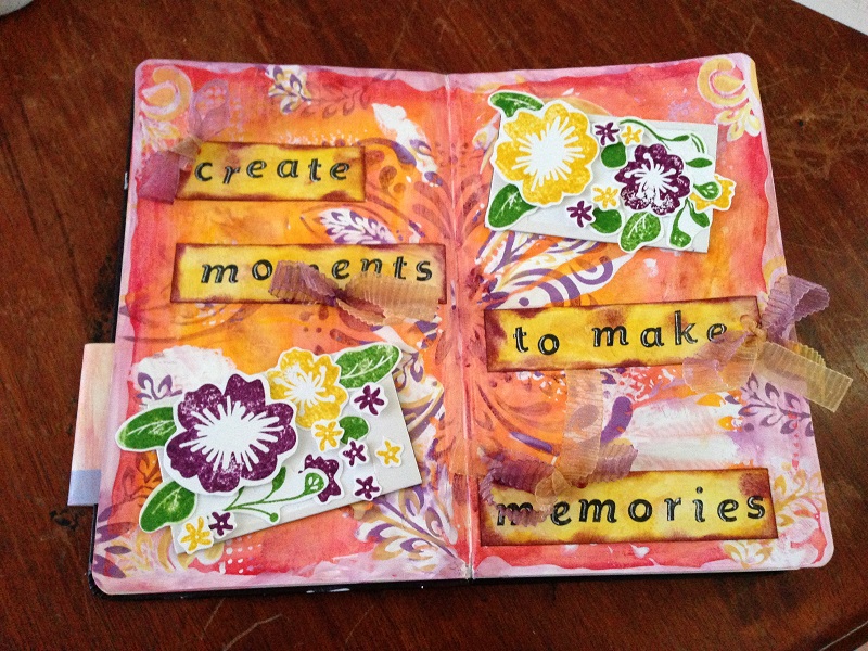
Originally I was going to just stop at the sentiment tags and call the layout complete, but I decided I didn’t like the gaps in either corner so I thought I would make a photo frame and have flowers inside it. This embellishment really didn’t turn out how I had originally thought, but I’m happy with the end result even though it wasn’t what I had envisioned.

My original thought was to to cut a piece of white card stock in a rectangle shape and use distress ink on it and then cut a smaller piece of black card stock in a square and place it in the top section of the rectangle to make it look like a photo. And then when I was rummaging through my supplies I found some pre-made photo frame embellishments that my mother-in-law bought for me.

So I thought, ‘yay – time saver I’ll just use that instead’. The white frame part was very glossy though, so I didn’t think the ink would work to well on it and I was having second thoughts about using the inking technique again anyway. I thought it might just make it all blend in too much or be too repetitive.

So I left the border crisp and white and then I cut a square of white card stock and placed it over the black to create an all white background.

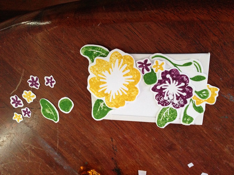
I stamped a whole bunch of flowers on scrap pieces of white card stock using the Simon Says Stamp Exclusive Set of Stamps “Flowers On My Mind” from the Simon Says Stamp Card Kit 2015 (which I totally loved, by the way, and has been my favourite so far).

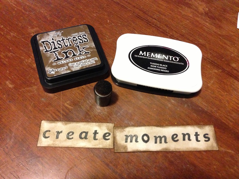
I stamped them in the matching yellow and purple colours using the Tim Holtz Distress Ink in the Mustard Seed and Seedless Preserve. I stamped the leaves, also from the the Simon Says Stamp “Flowers On My Mind” stamp set, using the Tim Holtz Distress Ink ‘Mowed Lawn’.

The stamping was a bit rough and splotchy, but I kind of liked the effect so I didn’t try and touch it up or fix it at all. I used a pair of scissors to fussy cut all the flowers and leaves out and then I started to arranged them on the two photo cards I had.

Simon-Says-Stamp-Card-Kit-March-2015

Multi-Media Art Journal 1 – Layout 1 – Part 10 – Adhering Tags

The next step was to adhere the sentiment tags to the page. I used Faber Castell’s gel medium. I covered the bottom placed it down and just had to go over the edges a little. The only tag to give me a little bit of trouble was the ‘to make’ tag as the right-hand side corner above the bow kept trying to stick up. It took a little negotiating, but eventually I was victorious!

“ψ(`∇´)ψ

Faber-Castell-Gel-Medium-Adhesive